We’re excited to announce some big improvements to the ordering experience in Candid! Here’s a quick rundown of what’s new and what’s different.
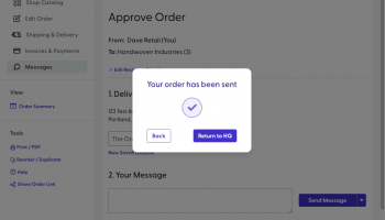
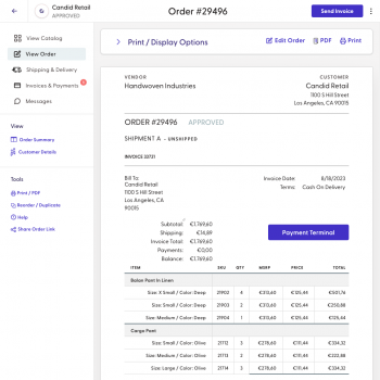
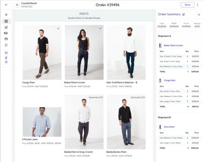
The biggest change is the new left-hand menu to help navigate your order. Whether you’re creating, reviewing, invoicing, printing or messaging, your order will always open to the correct view, with the others just a click away.
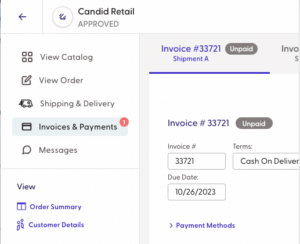
It’s now easier than ever to see at a glance which parts of the order lifecycle need your attention, with dedicated tabs and alert badges for both “Shipping & Delivery” and “Invoices & Payments.”
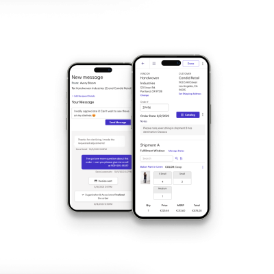
Finally, the mobile ordering interface has gotten a major overhaul, with less clutter, better organization, and more mobile-friendly inputs.

Thanks to everyone who gave us such great feedback over the past several months! We’ve updated our documentation for Sellers here and our documentation for Buyers here – please don’t hesitate to reach out if you have any questions!
